Chapter 24
Ten Distributions Worth Knowing
IN THIS CHAPTER
 Delving into distributions that may describe your data
Digging into distributions that arise during statistical significance testing
This chapter describes ten statistical distribution functions you’ll probably encounter in biological research. For each one, we provide a graph of what that distribution looks like, as well as some useful or interesting facts and formulas. You find two general types of distributions here:
- Distributions that describe random fluctuations in observed data: Your study data will often conform to one of the first seven common distributions. In general, these distributions have one or two adjustable parameters that allow them to fit the fluctuations in your observed data.
- Common test statistic distributions: The last three distributions don’t describe your observed data. Instead, they describe how a test statistic that is calculated as part of a statistical significance test will fluctuate if the null hypothesis is true. The Student t, chi-square, and Fisher F distributions allow you to calculate test statistics to help you decide if observed differences between groups, associations between variables, and other effects you want to test should be interpreted as due to random fluctuations or not. If the apparent effects in your data are due only to random fluctuations, then you will fail to reject the null hypothesis. These distributions are used with the test statistics to obtain p values, which indicate the statistical significance of the apparent effects. (See Chapter 3 for more information on significance testing and p values.)
 This chapter provides a very short table of critical values for the t, chi-square, and F distributions. A critical value is the value that your calculated test statistic must exceed in order for you to declare statistical significance at the α = 0.05 level. For example, the critical value for the normal distribution is 1.96 at α = 0.05.
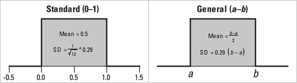
The Uniform Distribution
The uniform distribution is the simplest distribution. It’s a continuous number between 0 and 1. To generalize, it is a continuous number between a and b, with all values within that range equally likely (see Figure 24-1). The uniform distribution has a mean value of  and a standard deviation of
  . The uniform distribution arises in the following contexts:
- Round-off errors are uniformly distributed. For example, a weight recorded as 85 kilograms (kg) can be thought of as a uniformly distributed random variable between a = 84.5 kg and b = 85.5 kg. This causes the mean to be (84.5 + 85.5)/2 = 85 kg, with a standard error of (84.4 – 84.5)/√12, which is 1/3.46 = 0.29 kg.
- In the case the null hypothesis is true, the p value from any exact significance test is uniformly distributed between 0 and 1.
© John Wiley & Sons, Inc.
FIGURE 24-1: The uniform distribution.
The Microsoft  generates a random number drawn from the standard uniform distribution.
The Normal Distribution
The most popular and widely-used distribution is the normal distribution (also called the Gaussian distribution and the probability bell curve). It describes variables whose fluctuations are the combined result of many independent causes. Figure 24-2 shows the shape of the normal distribution for various values of the mean and standard deviation. Many other distributions (binomial, Poisson, Student t, chi-square, Fisher F) become nearly normal-shaped for large samples.
The Microsoft  generates a normally distributed random number, with
  and
and  .
.

© John Wiley & Sons, Inc.
FIGURE 24-2: The normal distribution at various means and standard deviations.
The Log-Normal Distribution
This distribution is also called skewed. If a set of numbers is log-normally distributed, then the logarithms of those numbers will be normally distributed (see the preceding section “The normal distribution”). Laboratory values such as enzyme and antibody concentrations are often log-normally distributed. Hospital lengths of stay, charges, and costs are also approximately log-normal.
You should suspect log-normality if the standard deviation of a set of numbers is so big it’s in the ballpark of the size of the mean. Figure 24-3 shows the relationship between the normal and log-normal distributions.
If a set of log-normal numbers has a mean A and standard deviation D, then the natural logarithms of those numbers will have a standard deviation  , and a mean
  .
.

© John Wiley & Sons, Inc.
FIGURE 24-3: The log-normal distribution.
The Binomial Distribution
The binomial distribution helps you estimate the probability of getting x successes out of N independent tries when the probability of success on one try is p. (See Chapter 3 for an introduction to probability.) A common example of the binomial distribution is the probability of getting x heads out of N flips of a coin. If the coin is fair, p = 0.5, but if it is lopsided, p could be greater than or less than 0.5 (such as p = 0.7). Figure 24-4 shows the frequency distributions of three binomial distributions, all having  but having different N values.

© John Wiley & Sons, Inc.
FIGURE 24-4: The binomial distribution.
The formula for the probability of getting x successes in N tries when the probability of success on one try is p is  .
.
Looking across Figure 24-4, you might have guessed that as N gets larger, the binomial distribution’s shape approaches that of a normal distribution with mean  and standard deviation
  .
.
 The arc-sine of the square root of a set of proportions is approximately normally distributed, with a standard deviation of
  . Using this transformation, you can analyze data consisting of observed proportions with t tests, ANOVAs, regression models, and other methods designed for normally distributed data. For example, using this transformation, you could use these methods to statistically compare proportions of participants who responded to treatment in two different treatment groups in a study. However, whenever you transform your data, it can be challenging to back-transform the results and interpret them.
The Poisson Distribution
The Poisson distribution gives the probability of observing exactly N independent random events in some interval of time or region of space if the mean event rate is m. The Poisson distribution describes fluctuations of random event occurrences seen in biology, such as the number of nuclear decay counts per minute, or the number of pollen grains per square centimeter on a microscope slide. Figure 24-5 shows the Poisson distribution for three different values of m.

© John Wiley & Sons, Inc.
FIGURE 24-5: The Poisson distribution.
The formula to estimate probabilities on the Poisson distribution is  .
.
Looking across Figure 24-5, you might have guessed that as m gets larger, the Poisson distribution’s shape approaches that of a normal distribution, with mean  and standard deviation
  .
.
The square roots of a set of Poisson-distributed numbers are approximately normally distributed, with a standard deviation of 0.5.
The Exponential Distribution
If a set of events follows the Poisson distribution, the time intervals between consecutive events follow the exponential distribution, and vice versa. Figure 24-6 shows the shape of two different exponential distributions.
The Microsoft  makes exponentially distributed random numbers with mean
  .
.

© John Wiley & Sons, Inc.
FIGURE 24-6: The exponential distribution.
The Weibull Distribution
This distribution describes failure times for devices (such as light bulbs), where the failure rate can be constant, or can change over time depending on the shape parameter, k. It is also used in human survival analysis, where failure is an outcome (such as death). In the Weibull distribution, the failure rate is proportional to time raised to the  power, as shown in Figure 24-7a.
- If
 , the failure rate has a lot of early failures, but these are reduced over time.
 - If
 , the failure rate is constant over time, following an exponential distribution.
 - If
 , the failure rate increases over time as items wear out.
Figure 24-7b shows the corresponding cumulative survival curves.
The Weibull distribution shown in Figure 24-7 leads to survival curves of the form Survival , which are widely used in industrial statistics. But survival methods that don’t assume a distribution for the survival curve are more common in biostatistics (we cover examples in Chapters 21, 22, and 23).

© John Wiley & Sons, Inc.
FIGURE 24-7: The Weibull distribution.
The Student t Distribution
This family of distributions is most often used when comparing means between two groups, or between two paired measurements. Figure 24-8 shows the shape of the Student t distribution for various degrees of freedom. (See Chapter 11 for more info about t tests and degrees of freedom.)

© John Wiley & Sons, Inc.
FIGURE 24-8: The Student t distribution.
In Figure 24-8, as the degrees of freedom increase, the shape of the Student t distribution approaches that of the normal distribution.
Table 24-1 shows the critical t value for various degrees of freedom at α = 0.05.
Under α = 0.05, random fluctuations cause the t statistic to exceed the critical t value only 5 percent of the time. This 5 percent includes exceeding t on either the positive or negative side. From the table, if you determine your critical t is 2.01 at 50 df, and your test statistic is 2.45, it exceeds the critical t, and is statistically significant at α = 0.05. But this would also be true if your test statistic was –2.45, because the table only presents absolute values of critical t.
TABLE 24-1 Critical Values of Student t for α = 0.05
Degrees of Freedom |
|
|---|---|
1 |
12.71 |
2 |
4.30 |
3 |
3.18 |
4 |
2.78 |
5 |
2.57 |
6 |
2.45 |
8 |
2.31 |
10 |
2.23 |
20 |
2.09 |
50 |
2.01 |
∞ |
1.96 |

For other α and df values, the Microsoft Excel formula =T.INV.2T(α, df) gives the critical Student t value.
The Chi-Square Distribution
This family of distributions is used most commonly for two purposes: testing goodness-of-fit between observed and expected event counts, and for testing for association between categorical variables. Figure 24-9 shows the shape of the chi-square distribution for various degrees of freedom.
As you look across Figure 24-9, you may notice that as the degrees of freedom increase, the shape of the chi-square distribution approaches that of the normal distribution. Table 24-2 shows the critical chi-square value for various degrees of freedom at α = 0.05.
Under α = 0.05, random fluctuations cause the chi-square statistic to exceed the critical chi-square value only 5 percent of the time. If the chi-square value from your test exceeds the critical value, the test is statistically significant at α = 0.05.
For other α and df values, the Microsoft Excel formula = CHIINV(α, df) gives the critical  value.

© John Wiley & Sons, Inc.
FIGURE 24-9: The chi-square distribution.
TABLE 24-2 Critical Values of Chi-Square for α = 0.05
Degrees of Freedom |
|
|---|---|
1 |
3.84 |
2 |
5.99 |
3 |
7.81 |
4 |
9.49 |
5 |
11.07 |
6 |
12.59 |
7 |
14.07 |
8 |
15.51 |
9 |
16.92 |
10 |
18.31 |

The Fisher F Distribution
This family of distributions is frequently used to obtain p values from an analysis of variance (ANOVA). Figure 24-10 shows the shape of the Fisher F distribution for various degrees of freedom.

© John Wiley & Sons, Inc.
FIGURE 24-10: The Fisher F distribution.
Random fluctuations cause F to exceed the critical F value only 5 percent of the time. If the F value from your ANOVA exceeds this value, the test is statistically significant at α = 0.05. For other values of α,  , and
, and  , the Microsoft Excel formula = FINV(α, df1, df2) will give the critical F value.