Chapter 22
Comparing Survival Times
IN THIS CHAPTER
 Using the log-rank test to compare two groups
Thinking about more complicated ways to compare the survival experience
Calculating the necessary sample size to compare survival times
The life table and Kaplan-Meier survival curves described in Chapter 21 are ideal for summarizing and describing the time to the first or only occurrence of a particular event based on times observed in a sample of individuals. They correctly incorporate data that reflect when an individual is observed during the study but does not experience the event, which is called censored data. Animal and human studies involving endpoints that occur on a short time-scale, like measurements taking during an experimental surgical procedure, may yield totally uncensored data. However, the more common situation is that during the observation period of studies, not all individuals experience the event, so you usually have censored data on your hands.
In biological research and especially in clinical trials (discussed in Chapter 5), you often want to compare survival times between two or more groups of individuals. In humans, this may have to do with survival after cancer surgery. In animals, it may have to do with testing the toxicity of a potential therapeutic. This chapter describes an important method for comparing survival curves between two groups called the log-rank test, and explains how to calculate the sample size you need to have sufficient statistical power for this test (see Chapter 3). The log-rank test can be extended to handle three or more groups, but this discussion is beyond the scope of this book.
 In this chapter, as in Chapters 21 and 23, we use the term survival in reference to the outcome of death. However, all the calculations pertain to any type of outcome event being studied, including good ones, such as cancer going into remission.
 There is some ambiguity associated with the name log-rank test. It has also been called different names (such as the Mantel-Cox test), and has been extended into variants such as the Gehan-Breslow test. You may also observe that different software may calculates the log-rank test slightly differently. In this chapter, we describe the most commonly used form of the log-rank test.
If have no censored observations in your data, you can skip most of this chapter. This may happen if, for example, death is your outcome and at the end of your study period no individuals are alive anymore — they all have died in your study. As you may guess, this situation is much more common in animal studies than human studies. But if you have followed all the individuals in your data until they all experienced the outcome, and you have two or more groups of numbers indicating survival times that you want to compare, you can use approaches described in Chapter 11. One option is to use an unpaired Student t test to test whether one group has a statistically significantly longer mean survival time than the other. If you have three or more groups, you would use an ANOVA instead. But because survival times are very likely to be non-normally distributed, you may prefer to use a nonparametric test, such as the Wilcoxon Sum-of-Ranks test or Mann-Whitney U test, to compare the median survival time between two groups. With more than two groups, you would use the nonparametric Kruskal-Wallis test.
Suppose that you conduct a toxicity study with laboratory animals of a potential cancer drug. You obtain 90 experimental mice. The mice are randomly placed in groups such that 60 receive the drug in their food, and 30 are given control food with no drug. A laboratory worker observes them and records their vital status every day after the experiment starts, taking note of when each animal dies or is censored, meaning they are taken out of the study for another reason (such as not eating). You perform a life-table analysis on each group of mice — the drug compared to control — as described in Chapter 21, and graph the results. The graph displays the survival curves shown in Figure 22-1. As a bonus, the two life tables generated to support this display also provide the summary information needed the log-rank test.
The two survival curves in Figure 22-1 look different. The drug group seems to be showing better survival than the control group. But is this apparent difference real, or could it be the result of random fluctuations only? The log-rank test answers this question.

© John Wiley & Sons, Inc.
FIGURE 22-1: Survival curves for two groups of laboratory animals.
Comparing Survival between Two Groups with the Log-Rank Test
The log-rank test can be performed using individual-level data, or on data that has been summarized into a life-table format. In this section, we describe how to run a log-rank test with statistical software, which is how it is usually done. Next, to help you understand the underlying calculations, we describe the log-rank test calculations in detail using the life-table as you might carry them out manually using spreadsheet software such as Microsoft Excel.
Understanding what the log-rank test is doing
A two-group log-rank test asks whether events — which are deaths in our example — are split between the two groups in the same proportion as the number of at-risk individuals in the two groups. The computer selects a group and sums the difference between the observed and expected number of deaths in each time slice over all the time slices to get the total excess deaths for that group. The excess death sum is then scaled down, meaning it is divided by an estimate of its standard deviation. (Later in this chapter we describe how to calculate that standard deviation estimate.) The scaled-down excess deaths sum is a number whose random sampling fluctuations should follow a normal distribution, and from which a p value can be easily calculated. The null hypothesis of the log-rank test is that there is no difference in survival between the two groups, so a p value less than your selected α (usually 0.05) indicates a statistically significant difference.
Don’t worry if the preceding paragraph makes your head spin. It is only meant to give you a general sense behind the calculations in the log-rank test.
Running the log-rank test on software
Most commercial statistical software packages (like those described in Chapter 4) can perform a log-rank test. You first organize your data into a table that has one row per individual, and these three columns:
- Group: The group variable contains a code indicating the individual’s group. In this example, we could use the code Drug = 1 and Control = 2.
- Time: A numerical variable containing the individual’s survival time. For individuals experiencing the event during the study, it represents time to event. For censored individuals, it is time to the end of observation.
- Event status: A variable that indicates the individual’s status at the end of observation. If they got the event, it is usually coded as 1, and if not or they are censored, it is coded as 0.
To run the log-rank test, you tell your computer program which variable represents the group variable, which one means time, and which one contains the event status. The program should produce a p value for the log-rank test. If you set α = 0.05 and the p value is less than that, you reject the null and conclude that the two groups have statistically significantly different survival curves.
In addition to the p value, the program may output median survival time for each group along with confidence intervals, and difference in median times between groups. If possible, you will also want to request graphs that show whether your data are consistent with the hazard proportionality assumption that we describe later in “Assessing the assumptions.”
Looking at the calculations
The log-rank test should not be done manually because it is an error-prone task. But we believe you’ll have a better appreciation of the log-rank test if you understand how it works, so we describe how the calculations could theoretically be carried out using a Microsoft Excel spreadsheet.
The log-rank test utilizes information from the life tables needed to produce the graph shown earlier in Figure 22-1. Figure 22-2 shows a portion of the life tables that produced the curves shown in Figure 22-1, with the data for the two groups displayed side by side.

© John Wiley & Sons, Inc.
FIGURE 22-2: A portion of the life-table calculations for two groups of laboratory animals.
In Figure 22-2, the Drug group’s results are in columns B through E, and the Control group’s results are in columns F through I. The only measurements needed from Figure 22-2 for the log-rank test are At risk (columns E and I), meaning number at risk in each time slice for each group, and Died (columns C and G), meaning the number of observed deaths in that time slice for each group. The log-rank test calculations are in a second spreadsheet (shown in Figure 22-3).

© John Wiley & Sons, Inc.
FIGURE 22-3: Basic log-rank calculations done manually (but please use software instead!).
The spreadsheet shown in Figure 22-3 has the following columns:
- Column A identifies the time slices, consistent with Figure 22-2.
- Columns B and C pertain to the Drug group, and reprint the At risk and Died columns from Figure 22-2 for that group. Columns D and E pertain to the Control group and reprint the At risk and Died columns from Figure 22-2 for that group.
- Columns F and G show the combined total number of individuals at risk and the total number of individuals who died, which is obtained by combining the corresponding columns for the two groups.
- Column H, labeled % At Risk, shows Group 1’s percentage of the total number of at-risk individuals per time slice.
- Column I, labeled Expected Deaths, shows the number of deaths you’d expect to see in Group 1 based on apportioning the total number of deaths (in both groups) by Group 1’s percentage of total individuals at-risk. For the 0–1 day row, Group 1 had about
 of the 89 individuals at risk, so you’d expect it to have about
  of the nine deaths.
 - Column J, labeled Excess Deaths, shows the excess number of actual deaths compared to the expected number for Group 1.
- Column K shows the variance (equal to the square of the standard deviation) of the excess deaths. It’s obtained from this complicated formula that’s based on the properties of the binomial distribution (see Chapter 24):

For the first time slice (0–1 day), this becomes:
 , which equals approximately 1.813.
N refers to the number of individuals at risk, D refers to deaths, the subscripts 1 and 2 refer to groups 1 and 2, and T refers to the total of both groups combined.
Next, you add up the excess deaths in all the time slices to get the total number of excess deaths for Group 1 compared to what you would have expected if the deaths had been distributed between the two groups in the same ratio as the number of at-risk individuals.
Then you add up all the variances. You are allowed to do that, because the sum of the variances of the individual numbers is equal to the variance of the sum of a set of numbers.
Finally, you divide the total excess deaths by the square root of the total variance to get a test statistic called Z:

The Z value is approximately normally distributed, so you can obtain a p value from a table of the normal distribution or from an online calculator. For the data in Figure 23-3, 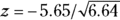 , which is 2.19. This z value corresponds to a p value of 0.028, so the null hypothesis is rejected, and you can conclude that the two groups have a statistically significantly different survival curve.
Note: By the way, it doesn’t matter which group you assign as Group 1 in these calculations. The final results come out the same either way.
Assessing the assumptions
Like all statistical tests, the log-rank test assumes that you studied an unbiased sample from the population about which you’re trying to draw conclusions. It also assumes that any censoring that occurred was due to circumstances unrelated to the treatment being tested (for example, individuals didn’t drop out of the study because the drug made them sick).
Also, the log-rank test looks for differences in overall survival time. In other words, it’s not good at detecting differences in shape between two survival curves with similar overall survival time, like the two curves shown in Figure 22-4. These two curves actually have the same median survival time, but the survival experience is different, as shown in the graph. When two survival curves cross over each other, as shown in Figure 22-4b, the excess deaths are positive for some time slices and negative for others. This leads them to cancel out when they’re added up, producing a smaller z value as a test statistic z value, which translates to larger, non-statistically significant p value.

© John Wiley & Sons, Inc.
FIGURE 22-4: Proportional (a) and nonproportional (b) hazards relationships between two survival curves.
Therefore, one very important assumption of the log-rank test is that the two groups have proportional hazards, which means the two groups must have generally similar survival shapes, as shown in Figure 22-4a. Flip to Chapter 21 for more about survival curves, and read about hazards in more detail in Chapter 23.
Considering More Complicated Comparisons
The log-rank test is good for comparing survival between two or more groups. But it doesn’t extend well to more complicated situations. What if you want to do one of the following?
- Test whether survival depends on age or some other continuous variable
- Test the simultaneous effect of several variables, or their interactions, on survival
- Correct for the presence of confounding variables or other covariates
In other areas of statistical testing, such situations are handled by regression techniques. Survival analysis regression uses survival outcomes with censored observations, and can accommodate these analyses. We describe survival regression in Chapter 23.
Estimating the Sample Size Needed for Survival Comparisons
We introduce power and sample size in Chapter 3. Calculating the sample size for survival comparisons is complicated by several factors:
- The need to specify an alternative hypothesis: This hypothesis can take the form of a hazard ratio, described in Chapter 23, where the null hypothesis is that the hazard ratio = 1. Or, you can hypothesize the difference between two median survival times.
- The impact of censoring: How censoring impacts sample size needed depends on the accrual rate, dropout rate, and the length of follow-up.
- The shape of the survival curves: For sample-size calculations, it is often assumed that the survival curve is exponential, but that may not be realistic.
 In Chapter 4, we recommend using free software G*Power for your sample-size calculations. However, because G*Power does not offer a survival sample-size estimator, for this, we recommend you use another free software package called PS (Power and Sample Size Calculation), which is available from Vanderbilt University Medical Center (
https://biostat.app.vumc.org/wiki/Main/PowerSampleSize).
After opening the PS program, choose the Survival tab, fill in the form, and click Calculate. The median survival times for the two groups are labeled m1 and m2, the accrual interval is labeled A, the post-accrual follow-up period is labeled F, and the group allocation proportion is labeled m. Note that the time variables must always be entered in the same units (days, in this example). You will also need to enter your chosen α and power.
Here is an example. Suppose that you’re planning a study to compare an experimental drug for keeping cancer remission to placebo in two equal-sized groups of cancer patients whose cancer is in remission. You expect to observe participants for a total of three years to see whether their cancer returns (which is the outcome). From existing studies, you expect the median placebo time to be 20 months, and you think the drug should extend this to 30 months. If it truly does extend survival (time to remission) that much, you want to be able to detect this. You set α = 0.05 and power at 80 percent so that you have an 80 percent chance of getting a p value of less than 0.05 when you compare drug to placebo using the log-rank test. If you fill in the PS form with these estimates and select Calculate, under Sample Size the software will say you need 170 participants in each group (a total of 340 participants).