Chapter 13
Taking a Closer Look at Fourfold Tables
IN THIS CHAPTER
 Beginning with the basics of fourfold tables
Digging into sampling strategies for fourfold tables
Using fourfold tables in different scenarios
In Chapter 12, we show you how to compare proportions between two or more groups with a cross-tab table. In general, a cross-tab shows the relationship between two categorical variables. Each row of the table represents one particular category of one of the variables, and each column of the table represents one particular category of the other variable. The table can have two or more rows and two or more columns, depending on the number of different categories or levels present in each of the two variables. (To refresh your memory about categorical variables, read Chapter 8.)
Imagine that you are comparing the performance of three treatments (Drug A, Drug B, and Drug C) in patients who could have four possible outcomes: improved, stayed the same, got worse, or left the study due to side effects. In such a case, your treatment variable would have three levels so your cross-tab would have three rows, and your outcome variable would have four levels so your cross-tab would have four columns.
But this chapter only focuses on the special case that occurs when both categorical variables in the table have only two levels. Other words for two-level variables are dichotomous and binary. A few examples of dichotomous variables are hypertension status (hypertension or no hypertension), obesity status (obese or not obese), and pregnancy status (pregnant or not pregnant). The cross-tab of two dichotomous variables has two rows and two columns. Because a 2 × 2 cross-tab table has four cells, it’s commonly called a fourfold table. Another name you may see for this table is a contingency table.
Chapter 12 includes a discussion of fourfold tables, and all that is included in Chapter 12 applies not only to fourfold tables but also to larger cross-tab tables. But because the fourfold table plays a pivotal role in public health with regard to certain calculations used commonly in epidemiology and biostatistics, it warrants a chapter all its own — this one! In this chapter, we describe several common research scenarios in which fourfold tables are used, which are: comparing proportions, testing for association, evaluating exposure and outcome associations, quantifying the performance of diagnostic tests, assessing the effectiveness of therapies, and measuring inter-rater and intra-rater reliability. In each scenario, we describe how to calculate several common measures called indices (singular: index), along with their confidence intervals. We also describe ways of sampling called sampling strategies (see Chapter 6 for more on sampling).
Focusing on the Fundamentals of Fourfold Tables
In contemplating statistical testing in a fourfold table, consider the process. As described in Chapter 12, you first formulate a null hypothesis (H0) about the fourfold table, set the significance level (such as α = 0.05), calculate a test statistic, find the corresponding p value, and interpret the result. With a fourfold table, one obvious test to use is the chi-square test (if necessary assumptions are met). The chi-square test evaluates whether membership in a particular row is statistically significantly associated with membership in a particular column. The p value on the chi-square test is the probability that random fluctuations alone, in the absence of any real effect in the population, could have produced an observed effect at least as large as what you saw in your sample. If the p value is less than α (which is 0.05 in your scenario), the effect is said to be statistically significant, and the null is rejected. Assessing significance using a chi-square test is the most common approach to testing a cross-tab of any size, including a fourfold table. But fourfold tables can serve as the basis for developing other metrics besides chi-square tests that can be useful in other ways, which are discussed in this chapter.
 In the rest of this chapter, we describe many useful calculations that you can derive from the cell counts in a fourfold table. The statistical software that cross-tabulates your raw data can provide these indices depending upon the commands it has available (see Chapter 4 for a review of statistical software). Thankfully (and uncharacteristically), unlike in most chapters in this book, the formulas for many indices derived from fourfold tables are simple enough to do manually with a calculator (or using Microsoft Excel). All you need are the counts or frequencies of each of the four cells. For these indices, you can also use a web page for calculation, which is available here:
 https://statpages.info/ctab2x2.html. This chapter demonstrates how to calculate these indices in R (a free, open-source software described in Chapter 4).
Like any other value you calculate from a sample, an index calculated from a fourfold table is a sample statistic, which is an estimate of the corresponding population parameter. A good researcher always wants to quote the precision of that estimate. In Chapter 10, we describe how to calculate the standard error (SE) and confidence interval (CI) for sample statistics such as means and proportions. Likewise, in this chapter, we show you how to calculate the SE and CI for the various indices you can derive from a fourfold table.
Though an index itself may be easy to calculate manually, its SE or CI usually is not. Approximate formulas are available for some of the more common indices. These formulas are usually based on the fact that the random sampling fluctuations of an index (or its logarithm) are often nearly normally distributed if the sample size is large enough. We provide approximate formulas for SEs where they’re available, and demonstrate how to calculate them in R when possible.
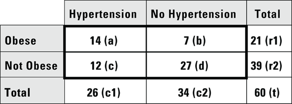
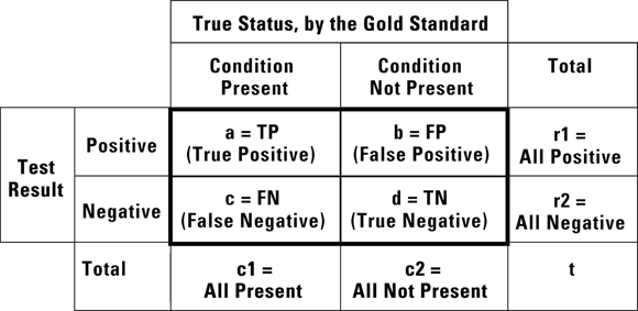
 For consistency, all the formulas in this chapter refer to the four cell counts of the fourfold table, and the row totals, column totals, and grand total, in the same standard way (see Figure 13-1). This convention is used in many online resources and textbooks.

© John Wiley & Sons, Inc.
FIGURE 13-1: These designations for cell counts and totals are used throughout this chapter.
Choosing the Correct Sampling Strategy
In this section, we assume you are designing a cross-sectional study (see Chapter 7 for a review of study design terminology). Using such a design, though you could not assess cause-and-effect, you could evaluate the association between an exposure (hypothesized cause) and outcome. For example, you may hypothesize that being obese (exposure) causes a patient to develop hypertension (abbreviated HTN, outcome) over time. However, in a cross-sectional study, exposure and outcome are measured at the same time, so you can only look for associations. If your exposure and outcome are binary (such as obese: yes/no and HTN: yes/no), you can use a fourfold table for this evaluation. But you would have to develop a sampling strategy that would support your analytic plan.
The example given here is for the use of a fourfold table to interpret a cross-sectional study. If you have heard of a fourfold table being analyzed as part of a cohort study or longitudinal study, that is referring to a series of cross-sectional studies done over time to the same group or cohort. Each round of data collection is called a wave, and fourfold tables can be developed cross-sectionally (using data from one wave), or longitudinally (using data from two waves).
As described in Chapter 6, you could try simple random sampling (SRS), but this may not provide you with a balanced number of participants who are positive for the exposure compared to negative to the exposure. If you are worried about this, you could try stratified sampling on the exposure (such as requiring half the sample to be obese, and half the sample to not be obese). Although other sampling strategies described in Chapter 6 could be used, SRS and stratified sampling are the most common to use in cross-sectional study. Why is your sampling strategy so important? As you see in the rest of this chapter, some indices are meaningful only if the sampling is done accordingly so as to support a particular study design.
Producing Fourfold Tables in a Variety of Situations
Fourfold tables can arise from a number of different scenarios, including the following:
- Comparing proportions between two groups (see Chapter 12)
- Testing whether two binary variables are associated
- Assessing associations between exposures and outcomes
- Evaluating diagnostic procedures
- Evaluating therapies
- Evaluating inter-rater reliability
Note: These scenarios can also give rise to tables larger than  , and fourfold tables can arise in other scenarios besides these.
Describing the association between two binary variables
Suppose you conduct a cross-sectional study by enrolling a random sample of 60 adults from the local population as participants in your study with the hypothesis that being obese is associated with having HTN. For the exposure, suppose you measure their height and weight, and use these values to calculate their body mass index (BMI). You then use their BMI to classify them as either obese or non-obese. For the outcome, you also measure their blood pressure in order to categorize them as having HTN or not having HTN. This is simple random sampling (SRS), as described in the earlier section “Choosing the Correct Sampling Strategy.” You can summarize your data in a fourfold table (see Figure 13-2).
The table in Figure 13-2 indicates that more than half of the obese participants have HTN and more than half of the non-obese participants don’t have HTN — so there appears to be a relationship between being a membership in a particular row and simultaneously being a member of a particular column. You can show this apparent association is statistically significant in this sample using either a Yates chi-square or a Fisher Exact test on this table (as we describe in Chapter 12). If you do these tests, your p values will be  and
and  , respectively, and at α = 0.05, you will be comfortable rejecting the null.
© John Wiley & Sons, Inc.
FIGURE 13-2: A fourfold table summarizing obesity and hypertension in a sample of 60 participants.
But when you present the results of this study, just saying that a statistically significant association exists between obesity status and HTN status isn’t enough. You should also indicate how strong this relationship is and in what direction it goes. A simple solution to this is to present the test statistic and p value to represent how strong the relationship is, and to present the actual results as row or column percentages to indicate the direction. For the data in Figure 13-2, you could say that being obese was associated with having HTN, because 14/21 = 66 percent of obese participants also had HTN, while only 12/39 = 31 percent of non-obese participants had HTN.
Quantifying associations
How strongly is an exposure associated with an outcome? If you are considering this question with respect to exposures and outcomes that are continuous variables, you would try to answer it with a scatter plot and start looking for correlation and linear relationships, as discussed in Chapter 15. But in our case, with a fourfold table, you are essentially asking: how strongly are the two levels of the exposure represented in the rows associated with the two levels of the outcome represented in the columns? In the case of a cohort study — where the exposure is measured in participants without the outcome who are followed longitudinally to see if they get the outcome — you can ask if the exposure was associated with risk of the outcome or protection from the outcome. In a cohort design, you could ask, “How much does being obese increase the likelihood of getting HTN?” You can calculate two indices from the fourfold table that describe this increase, as you discover in the following sections.
Relative risk and the risk ratio
In a cohort study, you seek to quantify the amount of risk (or probability) for the outcome that is conferred by having the exposure. The risk of getting a negative outcome is estimated as the fraction of participants who experience the outcome during follow-up (because in a cohort design, all participants do not have the outcome when they enter the study). Another term for risk is cumulative incidence rate (CIR). You can calculate the CIR for the whole study, as well as separately for each stratum of the exposure (in our case, obese and nonobese). Using the notation in Figure 13-1, the CIR for participants with the exposure is  . For the example from Figure 13-2, it’s
  , which is 0.667 (66.7 percent). And for those without the exposure, the CIR is represented by
  . For this example, the CIR is calculated as
  , which is 0.308 (30.8 percent).
The term exposure specifies a hypothesized cause of an outcome. If it is found that a certain exposure typically causes risk for an outcome, it is called a risk factor, and if it is found to confer protection, it is called a protective factor. Higher education has been found to be a protective factor against many negative outcomes (such as most injuries), and obesity has been found to be a risk factor for many negative outcomes (such as HTN and Type II diabetes).
The term relative risk refers to the amount of risk one group has relative to another. This chapter discusses different measures of relative risk that are to be used with different study designs. It is important to acknowledge here that technically, the term risk can only apply to cohort studies because you can only be at risk if you possess the exposure but not the outcome for some period of time in a study, and only cohort studies have this design feature. However, the other study designs — including cross-sectional and case-control — intend to estimate the relative risk you would get if you had done a cohort study, so they produce estimates of relative risk (see Chapter 7).
In a cohort study, the measure of relative risk used is called the risk ratio (also called cumulative incidence ratio). To calculate the risk ratio, first calculate the CIR in the exposed, calculate the CIR in the unexposed, then take a ratio of the CIR in the exposed to the CIR in the unexposed. This formula could be expressed as: 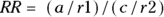 .
.
For this example, as calculated earlier, the CIR for the exposed was 0.667, and the CIR for the unexposed was 0.308. Therefore, the risk-ratio calculation would be  , which is 2.17. So, in this cohort study, obese participants were slightly more than twice as likely to be diagnosed as having HTN during follow-up than non-obese subjects.
Calculating a risk ratio as a measure of relative risk is appropriate for a cohort study. However, there are restrictions when creating measures of relative risk for cross-sectional and case-control designs. In a cross-sectional study, you would not calculate a CIR in the exposed and the unexposed because the exposure and outcome are measured at the same time, so there’s no time for any participants to experience any risk during the study. Instead, you would calculate the prevalence of the outcome in the exposed — which is  — and the prevalence of the outcome in the unexposed — which is
  (read Chapter 14 to for a discussion of prevalence). Notice that even though we use different wording, these are the same formulas as for the CIR. Then, instead of a risk ratio, in a cross-sectional study you would use a prevalence ratio, which is calculated the same way as the risk ratio: PR = (a/r1)/(c/r2).
 In a case-control study, for a measure of relative risk, you must use the odds ratio (discussed later in the section “Odds ratio”). You cannot use the risk ratio or prevalence ratio in a case-control study. The odds ratio can also be used as a measure of relative risk in a cross-sectional study, and can technically be used in a cohort study, although the preferred measure is the risk ratio.
Let’s go back to discussing the risk ratio. You can calculate an approximate 95 percent confidence interval (CI) around the observed risk ratio using the following formulas, which assume that the logarithm of the risk ratio is normally distributed:
- Calculate the standard error (SE) of the log of risk ratio using the following formula:

- Calculate Q with the following formula:
 where Q is simply a convenient intermediate quantity that will be used in the next part of the calculation, and e is the mathematical constant 2.718.
 - Find the lower and upper limits of the CI with the following formula:
For confidence levels other than 95 percent, replace the z-score of 1.96 in Step 2 with the corresponding z-score shown in Table 10-1 of Chapter 10. As an example, for 90 percent confidence levels, use 1.64, and for 99 percent confidence levels, use 2.58.
For the example in Figure 13-2, you calculate 95 percent CI around the observed risk ratio as follows:
 , which is 0.2855.
 , which is 1.75.
- The
 , which is 1.24 to 3.80.
Using this formula, the risk ratio would be expressed as 2.17, 95 percent CI 1.24 to 3.80.
 You could also use R to calculate a risk ratio and 95 percent CI for the fourfold table in Figure 13-2 with the following steps:
Create a matrix.
Create a matrix called obese_HTN with this code: obese_HTN <- matrix(c(14,12,7,27),nrow = 2, ncol = 2).
Load a library.
For many epidemiologic calculations, you can use the epitools package in R and use a command from this package to calculate the risk ratio and 95 percent CI. Load the epitools library with this command: library(epitools).
Run the command on the matrix.
In this case, run the riskratio.wald command on the obese_HTN matrix you created in Step 1: riskratio.wald(obese_HTN).
The output is shown in Listing 13-1.
LISTING 13-1 R output from risk ratio calculation on data from Figure 13-2
> riskratio.wald(obese_HTN)
$data
             Outcome
Predictor    Disease1 Disease2 Total
   Exposed1  14                7               21
   Exposed2  12                27              39
   Total     26                34              60

$measure
             risk ratio with 95% C.I.
Predictor    estimate          lower           upper
   Exposed1  1.000000          NA              NA
   Exposed2  2.076923          1.09512         3.938939

$p.value
             two-sided
Predictor    midp.exact        fisher.exact    chi.square
   Exposed1  NA                NA              NA
   Exposed2  0.009518722       0.01318013      0.00744125

$correction
[1] FALSE

attr(,”method”)
[1] "Unconditional MLE & normal approximation (Wald) CI"
>
Notice that the output is organized under the following headings: $data, $measure, $p.value, and $correction. Under the $measure section is a centered title that says risk ratio with 95% C.I. — which is more than a hint! Under that is a table with the following column headings: Predictor, estimate, lower, and upper. The estimate column has the risk ratio estimate (which you already calculated by hand and rounded off to 2.17). The lower and upper columns have the confidence limits, which R calculated as 1.09512 (round to 1.10) and 3.938939 (round to 3.94), respectively. You may notice that because R used a slightly different SE formula than our manual calculation, R’s CI was slightly wider.
Odds ratio
The odds of an event occurring is the probability of it happening divided by the probability of it not happening. Assuming you use p to represent a probability, you could write the odds equation this way:  . In a fourfold table, you would represent the odds of the outcome in the exposed as a/b. You would also represent the odds of the outcome in the unexposed as c/d.
Let’s apply this to the scenario depicted in Figure 13-2. This is a study of 60 individuals, where the exposure is obesity status (yes/no) and the outcome is HTN status (yes/no). Using the data from Figure 13-2, the odds of having the outcome for exposed participants would be calculated as  , which would be
  , which is 2.00. And the odds of having the outcome in the unexposed participants is c/d, which would be
  , which is 0.444.
Odds have no units. They are not expressed as percentages. See Chapter 3 for a more detailed discussion of odds.
When considering cross-sectional and cohort studies, the odds ratio (OR) represents the ratio of the odds of the outcome in the exposed to the odds of the outcome in the unexposed. In case-control studies, because of the sampling approach, the OR represents the ratio of the odds of exposure among those with the outcome to the odds of exposure among those without the outcome. But because any fourfold table has only one OR no matter how you calculate it, the actual value of the OR stays the same, but how it is described and interpreted depends upon the study design.
Let’s assume that Figure 13-2 presents data on a cross-sectional study, so we will look at the OR from that perspective. Because you calculate the odds in the exposed as a/b, and the odds in the unexposed as c/d, the odds ratio is calculated by dividing a/b by b/c like this: 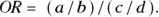
For this example, the OR is 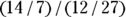 , which is
  , which is 4.50. In this sample, assuming a cross-sectional study, participants who were positive for the exposure had 4.5 times the odds of also being positive for the outcome compared to participants who were negative for the exposure. In other words, obese participants had 4.5 times the odds of also having HTN compared to non-obese participants.
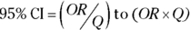
You can calculate an approximate 95 percent CI around the observed OR using the following formulas, which assume that the logarithm of the OR is normally distributed:
- Calculate the standard error of the log of the OR with the following formula:

- Calculate Q with the following formula:
 , where Q is simply a convenient intermediate quantity that will be used in the next part of the calculation, and e is the mathematical constant 2.718.
 - Find the limits of the confidence interval with the following formula:
Like with the risk ratio CI, for confidence levels other than 95 percent, replace the z-score of 1.96 in Step 2 with the corresponding z-score shown in Table 10-1 of Chapter 10. As an example, for 90 percent confidence levels, use 1.64, and for 99 percent confidence levels, use 2.58.
For the example in Figure 13-2, you calculate 95 percent CI around the observed OR as follows:
 , which is 0.5785.
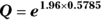 , which is 3.11.
 , which is 1.45 to 14.0.
Using these calculations, the OR is estimated as 4.5, and the 95 percent CI as 1.45 to 14.0.
To do this operation in R, you would follow the same steps as listed at the end of the previous section, except in Step 3, the command you’d run on the matrix is oddsratio.wald() using this code: oddsratio.wald(obese_HTN). The output is laid out the same way as shown in Listing 13-1, with a $measure section titled odds ratio with a 95% C.I. In that section, it indicates that the lower and upper confidence limits are 1.448095 (rounded to 1.45) and 13.98389 (rounded to 13.98), respectively. This time, R’s estimate of the 95 percent CI was close to the one you got with your manual calculation, but slightly narrower.
A wide 95 percent CI is the sign of an unstable (and not very useful) estimate. Consider a 95 percent CI for an OR that goes from 1.45 to 14.0. If you are interpreting the results of a cohort study, you are saying that obesity could increase the odds of getting HTN by as little as 1.45, or as much as 14! Most researchers try to solve this problem by increasing their sample size to reduce the size of their SE, which will in turn reduce the width of the CI.
Evaluating diagnostic procedures
Many diagnostic procedures provide a positive or negative test result — such as a COVID-19 test. Ideally, this result should correspond to the true presence or absence of the medical condition for which the test was administered — meaning a positive COVID-19 test should mean you have COVID-19, and a negative test should mean you do not. The true presence or absence of a medical condition is best determined by some gold standard test that the medical community accepts as perfectly accurate in diagnosing the condition. For COVID-19, the polymerase chain reaction (PCR) test is considered a gold standard test because of its high level of accuracy. But gold standard diagnostic procedures (like PCR tests) can be time-consuming and expensive, and in the case of invasive procedures like biopsies, they may be very unpleasant for the patient. Therefore, quick, inexpensive, and relatively noninvasive screening tests are very valuable, even if they are not perfectly accurate. They just need to be accurate enough to help filter in the best candidates for a gold standard diagnostic test.
Most screening tests produce some false positive results, which is when the result of the test is positive, but the patient is actually negative for the condition. Screening tests also produce some false negative results, where the result is negative in patients where the condition is present. Because of this, it is important to know false positive rates, false negative rates, and other features of screening tests to consider their level of accuracy in your interpretation of their results.
You usually evaluate a new, experimental screening test for a particular medical condition by administering the new test to a group of participants. These participants include some who have the condition and some who do not. For all the participants in the study, their status with respect to the particular medical condition has been determined by the gold standard method, and you are seeing how well your new, experimental screening test compares. You can then cross-tabulate the new screening test results against the gold standard results representing the true condition in the participants. You would create a fourfold table in a framework as shown in Figure 13-3.
© John Wiley & Sons, Inc.
FIGURE 13-3: This is how data are summarized when evaluating a proposed new diagnostic screening test.
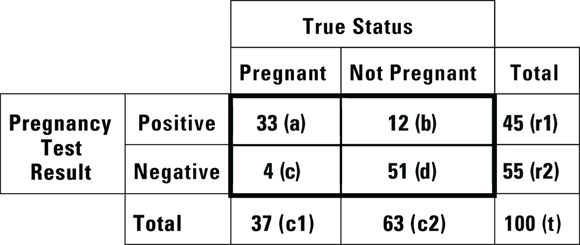
Imagine that you are conducting a study at a primary care clinic. In the study, you administer a newly developed home pregnancy test to 100 women who come to a primary care appointment suspecting that they may be pregnant. This is convenience sampling from a population defined as “all women who think they may be pregnant,” which is the population to whom a home pregnancy test would be marketed. At the appointment, all the participants would be given the gold standard pregnancy test, so by the end of the appointment, you would know their true pregnancy status according to the gold standard, as well as what your new home pregnancy test result said. Your results would next be cross-tabulated according to the framework shown in Figure 13-4.
© John Wiley & Sons, Inc.
FIGURE 13-4: Results from a study of a new experimental home pregnancy test.
The structure of the table in Figure 13-4 is important because if your results are arranged in that way, you can easily calculate at least five important characteristics of the experimental test (in our case, the home pregnancy test) from this table: accuracy, sensitivity, specificity, positive predictive value (PPV), and negative predictive value (NPV). We explain how in the following sections.
Overall accuracy
Overall accuracy measures how often a test result comes out the same as the gold standard result (meaning the test is correct). A perfectly accurate test never produces false positive or false negative results. In Figure 13-4, cells a and d represent correct test results, so the overall accuracy of the home pregnancy test is  . Using the data in Figure 13-4,
  , which is 0.84, or 84 percent.
Sensitivity and specificity
A perfectly sensitive test never produces a false negative result for an individual with the condition. Conversely, a perfectly specific test never produces a false positive result for an individual negative for the condition. The goal of developing a screening test is to balance the sensitivity against the specificity of the test based on the context of the condition, to optimize the accuracy and get the best of both worlds while minimizing both false positive and false negative results.
In a screening test with a sensitivity of 100 percent, the test result is always positive whenever the condition is truly present. In other words, the test will identify all individuals who truly have the condition. When a perfectly sensitive test comes out negative, you can be sure the person doesn’t have the condition. You calculate sensitivity by dividing the number of true positive cases by the total number of cases where the condition was truly present: a/c1 (that is, true positive/all present). Using the data in Figure 13-4,  , which is 0.89. This means that the home test comes out positive in only 89 percent of truly pregnant women, and the other 11 percent were really pregnant, but had a false positive result in the test.
A perfectly specific test never produces a false positive result for an individual without the condition. In a test that has a specificity of 100 percent, whenever the condition is truly absent, the test always has a negative result. In other words, the test will identify all individuals who truly do not have the condition. When a perfectly specific test comes out positive, you can be sure the person has the condition. You calculate specificity by dividing the number of true negative cases by the total number of cases where the condition was truly absent:  (that is, true negative/all not present). Using the data in Figure 13-4,
  , which is 0.81. This means that among the women who were not pregnant, the home test was negative only 81 percent of the time, and 11 percent of women who were truly negative tested as positive. (You can see why it is important to do studies like this before promoting the use of a particular screening test!)
But imagine you work in a lab that processes the results of screening tests, and you do not usually have access to the gold standard results. You may ask the question, “How likely is a particular screening test result to be correct, regardless of whether it is positive or negative?” When asking this about positive test results, you are asking about positive predictive value (PPV), and when asking about negative test results, you are asking about negative predictive value (NPV). These are covered in the following sections.
Sensitivity and specificity are important characteristics of the test itself. Observe that the answers depend on the prevalence of the condition in the background population. If the study population were older women, then the prevalence of being pregnant would be lower, and that would impact the sensitivity and specificity. The prevalence will also impact the PPV and NPV, which we discuss in the next section. For these reasons, it is important to use natural sampling in such a study design.
Positive predictive value and negative predictive value
The positive predictive value (PPV, also called predictive value positive) is the fraction of all positive test results that are true positives. In the case of the pregnancy test scenario, the PPV would be the fraction of the time a positive screening test result means that the woman is truly pregnant. PPV is the likelihood that a positive test result is correct. You calculate PPV as  . For the data in Figure 13-4, the PPV is
  , which is 0.73. So, if the pregnancy test result is positive, there’s a 73 percent chance that the woman is truly pregnant.
The negative predictive value (NPV, also called predictive value negative) is the fraction of all negative test results that are true negatives. In the case of the pregnancy test scenario, the NPV is the fraction of the time a negative screening test results means the woman is truly not pregnant. NPV is the likelihood a negative test result is correct. You calculate NPV as  . For the data in Figure 13-4, the NPV is
  , which is 0.93. So, if the pregnancy test result is negative, there’s a 93 percent chance that the woman is truly not pregnant.
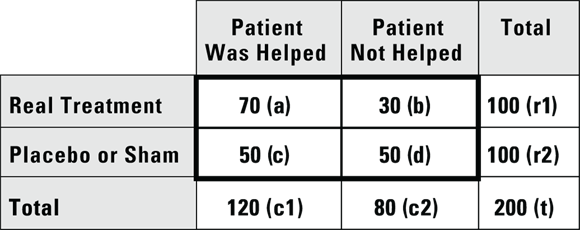
Investigating treatments
In conditions where there are no known treatments, one of the simplest ways to investigate a new treatment (such as a drug or surgical procedure) is to compare it to a placebo or sham condition using a clinical trial study design. Because many forms of dementia have no known treatment, it would be ethical to compare new treatments for dementia to placebo or a sham treatment in a clinical trial. In those cases, patients with the condition under study would be randomized (randomly assigned) to an active group (taking the real treatment) and a control group (that would receive the sham treatment), as randomization is a required feature of clinical trials. Because some of the participants in the control group may appear to improve, it is important that participants are blinded as to their group assignment, so that you can tell if outcomes are actually improved in the treatment compared to the control group.
Suppose you conduct a study where you enroll 200 patients with mild dementia symptoms, then randomize them so that 100 receive an experimental drug intended for mild dementia symptoms, and 100 receive a placebo. You have the participants take their assigned product for six weeks, then you record whether each participant felt that the product helped their dementia symptoms. You tabulate the results in a fourfold table, like Figure 13-5.
© John Wiley & Sons, Inc.
FIGURE 13-5: Comparing a treatment to a placebo.
According to the data in Figure 13-5, 70 percent of participants taking the new drug report that it helped their dementia symptoms, which is quite impressive until you see that 50 percent of participants who received the placebo also reported improvement. When patients report therapeutic effect from a placebo, it’s called the placebo effect, and it may come from a lot of different sources, including the patient’s expectation of efficacy of the product. Nevertheless, if you conduct a Yates chi-square or Fisher Exact test on the data (as described in Chapter 12) at α = 0.05, the results show treatment assignment was statistically significantly associated with whether or not the participant reported a treatment effect ( by either test).
Looking at inter- and intra-rater reliability
Many measurements in epidemiologic research are obtained by the subjective judgment of humans. Examples include the human interpretation of X-rays, CAT scans, ECG tracings, ultrasound images, biopsy specimens, and audio and video recordings of the behavior of study participants in various situations. Human researchers may generate quantitative measurements, such as determining the length of a bone on an ultrasound image. Human researchers may also generate classifications, such as determining the presence or absence of some atypical feature on an ECG tracing.
Humans who perform such determinations in studies are called raters because they are assigning ratings, which are values or classifiers that will be used in the study. For the measurements in your study, it is important to know how consistent such ratings are among different raters engaged in rating the same item. This is called inter-rater reliability. You will also be concerned with how reproducible the ratings are if one rater were to rate the same item multiple times. This is called intra-rater reliability.
When considering the consistency of a binary rating (like yes or no) for the same item between two raters, you can estimate inter-rater reliability by having each rater rate the same group of items. Imagine we had two raters rate the same 50 scans as yes or no in terms of whether each scan showed a tumor or not. We cross-tabbed the results and present them in Figure 13-6.
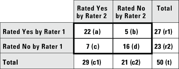
© John Wiley & Sons, Inc.
FIGURE 13-6: Results of two raters reading the same set of 50 specimens and rating each specimen yes or no.
Looking at Figure 13-6, cell a contains a count of how many scans were rated yes — there is a tumor — by both Rater 1 and Rater 2. Cell b counts how many scans were rated yes by Rater 1 but no by Rater 2. Cell c counts how many scans were rated no by Rater 1 and yes by Rater 2, and cell d shows where Rater 1 and Rater 2 agreed and both rated the scan no. Cells a and d are considered concordant because both raters agreed, and b and c are discordant because both raters disagreed.
Ideally, all the scans would be counted in concordant cells a or d of Figure 13-6, and discordant cells b and c would contain zeros. A measure of how close the data come to this ideal is called Cohen’s Kappa, and is signified by the Greek lowercase kappa: κ. You calculate kappa as:  .
.
For the data in Figure 13-6,  , which is 0.5138. How is this interpreted?
If the raters are in perfect agreement, then κ = 1. If you generate completely random ratings, you will see a κ = 0. You may think this means κ takes on a positive value between 0 and 1, but random sampling fluctuations can actually cause κ to be negative. This situation can be compared to a student taking a true/false test where the number of wrong answers is subtracted from the number of right answers as a penalty for guessing. When calculating κ, getting a score less than zero indicates the interesting combination of being both incorrect and unfortunate, and is penalized!
So, how do you interpret a κ of 0.5138? There’s no universal agreement as to an acceptable value for  . One common convention is that values of κ less than 0.4 are considered poor, those between 0.4 and 0.75 are acceptable, and those more than 0.75 are excellent. In this case, our raters may be performing acceptably.
For CIs forκ, you won’t find an easy formula, but the fourfold table web page (https://statpages.info/ctab2x2.html) provides approximate CIs. For the preceding example, the 95 percent CI is 0.202 to 0.735. This means that for your two raters, their agreement was 0.514 (95 percent CI 0.202 to 0.735), which suggests that the agreement level was acceptable.
You can construct a similar table to Figure 13-6 for estimating intra-rater reliability. You would do this by having one rater rate the same groups of scans in two separate sessions. In this case, in the table in Figure 13-6, you’d replace the by Rater with in Session in the row and column labels.